Upcoming Webinar - How organizations can benefit from our end to end Power BI Managed Services - 12th March - 2:00 PM SGT | Click to RegisterUpcoming Webinar - How organizations can benefit from our end to end Power BI Managed Services - 12th March - 2:00 PM SGT | Click to Register

Understand Your Data With

Data Visualization Services!

Identify patterns, trends, and analyze data intuitively to identify opportunities with data visualization consulting services.

Group.png

150+

Consultants

management-1.png

30+

Projects Completed

Mask-group-1.png

15+

Industries Served

Our Achievements

Group.png

150+

Consultants

management-1.png

30+

Projects Completed

15+

Industries Served

Our Achievements

0fcbcd05d57493541418cb4d7f6132c7.png

Data Visualization Experts

Visualize Data Like Never Before!

In today’s data-driven world, the ability to collect, analyze, and interpret large datasets is essential for any successful organization. But raw data alone doesn’t drive value it’s the insights you extract that lead to smarter decisions and competitive advantage.

As data volumes and complexity continue to increase, many businesses find it challenging to extract meaningful insights. This is where leveraging advanced data visualization techniques through professional services becomes a powerful solution, helping organizations interpret data more clearly and make informed decisions with confidence.

By transforming complex data into intuitive, interactive visuals, data visualization uncovers hidden patterns, trends, and relationships that are otherwise difficult to detect.

At PPN Solutions, our expert team delivers comprehensive data visualization services covering everything from consultation and design to implementation and continuous support. By leveraging the best tools for data visualization, we help you transform raw data into clear, actionable insights that drive smarter business decisions.

Data Acquisition

And Many More

Data Integration

Data Warehouse

Analysis

power-bi-logo
tableau-logo
org
mysql
app

And Many More

Report

And Many More

Our Process

Integration and Transformation Process of Data Visualization

The process starts by gathering data from sources, like spreadsheets, APIs, and other files. This data is then processed using an ETL (Extract, Transform, Load) engine that cleans, transforms, and combines it into a unified view.

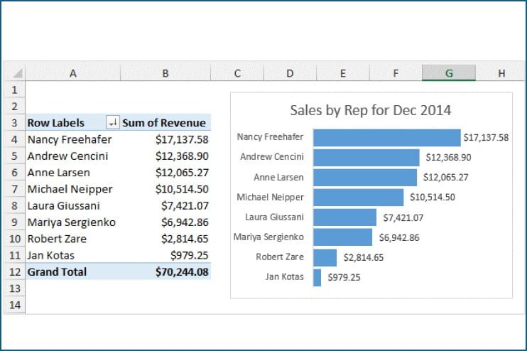
Then the integrated data is loaded into a data repository like a data warehouse or lake for efficient storage, access, and management. Various tools such, as Power BI and Tableau are then used to analyse the data and extract insights and meaningful patterns.

Finally, the analysed data is presented to you in an actionable manner enabling you to make informed decisions based on accurate information.

Process Behind Our Data Visualization Services

Meeting the Client

Requirements Gathering

Data Prep. & Analysis

Mockup Demo

Designing

User Testing

Maintenance/Support

Techniques We Use to Visualize Data Smartly​

Waterfall Charts

Waterfall charts show how an initial value is affected by a series of positive and negative changes. They’re commonly used for data analysis in financial statements, such as income or cash flow analysis. This chart helps break down the cumulative effect of sequential values clearly and efficiently.

Connectivity Charts

Connectivity charts illustrate the relationships or flows between multiple entities. Whether mapping out data pipelines, supply chains, or social networks, these charts make it easy to identify connections and dependencies within complex systems.

Funnel Charts

Funnel charts are used to represent stages in a process, typically showing a reduction in numbers as you move through each step. They’re ideal for visualizing sales pipelines, customer acquisition funnels, or any process with drop-off points. This chart helps identify where optimizations are needed.

Heat Maps

Heat maps use color gradients to represent data density or intensity across a dataset. They’re perfect for identifying trends, patterns, and outliers at a glance. Whether you’re analyzing user clicks on a webpage or regional performance, heat maps make the data instantly digestible.

Donut Charts

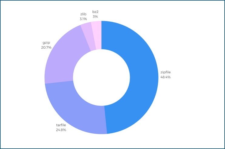
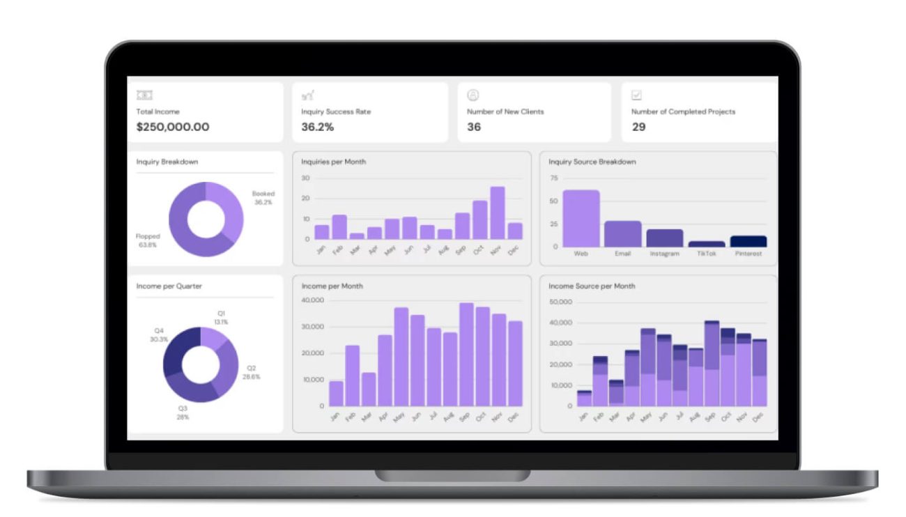
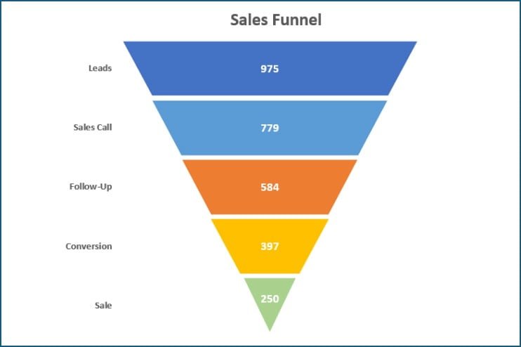
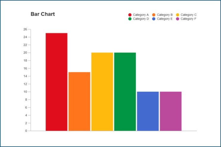
Donut charts function like pie charts but with a blank center, offering a cleaner visual and space for added context. They’re great for comparing parts of a whole, like category shares or performance breakdowns. Ideal for dashboards and executive summaries.

Pie Charts

Pie charts are a simple and intuitive way to show proportions within a dataset. Each slice represents a category’s contribution to the total, making them great for quick, high-level insights. They work best with limited data categories for maximum clarity.

Bar Charts

Bar charts provide a clear comparison between categories using rectangular bars. They’re perfect for visualizing numerical differences across groups such as departments, regions, or time periods. Both horizontal and vertical bars can be used depending on the context.

Line Charts

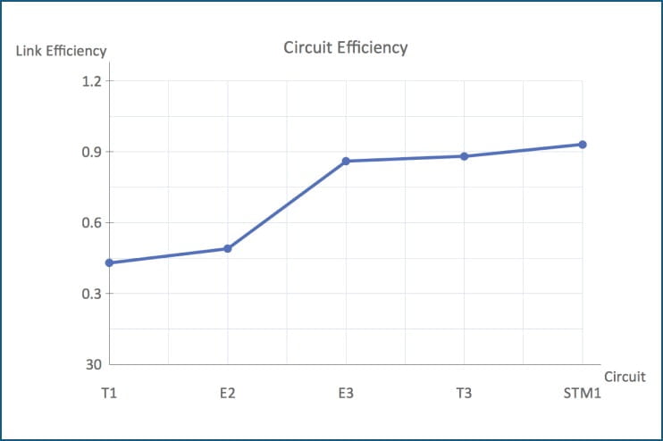
Line charts are the go-to tool for displaying trends over time. They’re highly effective in tracking metrics like sales, growth, or performance across days, months, or years. Multiple lines can be used to compare different data series side by side.

Symbol Maps

Symbol maps overlay data symbols (like circles or icons) on a geographic map to show location-based trends. These maps are useful for representing store locations, sales volumes, or population density. They bring a spatial perspective to your data analysis.

Pivot Tables

Pivot tables allow you to dynamically summarize large datasets with ease. They let users group, filter, and drill down into data without needing to alter the original set. Ideal for financial analysis, reporting, and quick data exploration.

Tool & Technologies

Data Visualization Tools & Technologies We Use

Why Choose Us?

Few reasons for people choosing PPN Solutions

From SAP, Zoho, and Board implementation to web development, staffing needs and digital marketing, we can help you with whatever your business needs to stand out in the market. 

REPLAN

Prebuilt Industry Specific Accelerator

Support and Training

Manage Services

Collaborative DNA

Successful Project Delivery

Passionate Team

Innovative and Complimentary Technologies

FAQ

Frequently Asked Questions

Let us illuminate the path forward with a proven track record, unparalleled expertise, and a commitment to turning your financial aspirations into triumphant realities. What sets us apart is not just our proficiency, but the promise of a transformative experience that propels your financial landscape into a realm of unprecedented success. So, why settle for the ordinary when the extraordinary awaits? Choose us, and let's embark on a journey where financial transformation meets unparalleled excellence.

Get a Holistic View of Performance: Gain a 360-degree view of your financial landscape. Our solutions integrate seamlessly, offering a comprehensive perspective on your organization's performance, and paving the way for informed decision-making.
 
Bring Agility in Decision-Making: In a fast-paced business environment, agility is key. Our solutions facilitate quick, informed decisions, ensuring that your FP&A processes keep pace with the dynamic nature of the market.
Say goodbye to cumbersome processes and hello to efficiency. Our solutions streamline FP&A workflows, allowing you to dedicate more time to strategic planning and analysis, ultimately fostering a culture of continuous improvement.The ability to adapt to changing business environments is crucial. FP&A automation equips organizations with the flexibility to adjust financial plans and forecasts swiftly, enabling them to navigate uncertainties and capitalize on opportunities effectively.

Assessing readiness for transformative FP&A solutions involves monitoring milestones like data complexity, performance bottlenecks, strategic expansion, and signals such as increased collaboration needs and real-time insights demand. Evaluating these indicators guides informed investment decisions.

Our Insights

Blog & News Update

Contact Us

Connect With Our Data Visualization Consultant!

Get a clear, concise view of your data to quickly spot trends, patterns, and insights that are hard to detect from raw numbers alone. That’s why data visualization is important it turns complex information into actionable insights, enabling smarter, data-driven decisions that fuel growth and profitability. With our expertise in data analysis and visualization, we help you uncover hidden opportunities, optimize resources, and boost overall business performance.

By presenting complex data in an intuitive and visually appealing way, our data visualization services enable stakeholders across your organization to understand and align around key metrics and goals easily. This fosters collaboration, streamlines decision-making, and ultimately drives better business outcomes. Whether you’re looking to improve supply chain efficiency, optimize pricing strategies, or enhance customer engagement, we can help you achieve your objectives.

Schedule a consultation.

Contact us

Fill in the details!

Submit the details below

Our expert will reach out shortly!